Analysis & Conclusions
The Montage feature of ImageJ perhaps produces the most straightforward and familiar transformation and re-presention of a filmic text. While this method retains the original chronological order of a film’s images (read top-to-bottom, left-to-right), it does “spatialize time” in presenting this chronology as a two-dimensional field which can be scanned and interrogated in ways a traditional viewing would not allow (even with the advent of digital scrubbing, slow-motion replay, etc.) (Ferguson, 2017, p. 278). We are able to observe a given moment in its unique context to others in the film, similar to viewing different features and details on geographic map and understanding their relationships to each other and the whole of the map’s construction. In seeing everything at once, we are able to “arrest the film’s temporality and separate narrative logic from other forms of knowledge” (Ferguson, 2016, p. 274). With respect to color, specifically, we can also glean a strong chromatic impression from having the visual palette of the film laid out in a single image. Below are montages created for all six films treated in this project, presented in chronological order:
We can also leverage other tools, such as digital video, to structure our interrogation of these montages in order to generate new ways of “viewing” the film. In the example below, the center spatial point of the montage for An Autumn Afternoon is used as our starting point. By slowly zooming out from the “heart” of the film, new pieces of visual information are gradually revealed as our field of vision becomes larger in scope. Evoking a structuring device similar to that used by Charles and Ray Eames’ in Powers of Ten (1972), this process of revealing and contextualization (albeit far less cosmic and profound than the Eames’ subject matter) offers a spatialized method of viewing that not only unbinds the film from its temporal construction but also allows for a reinvigorated approach to seeing how color operates in the film.
This breaking and reconfiguring of the filmic text can be further explored through the ImagePlot and related macros developed and released by Lev Manovich and the Software Studies Initiative. These tools allow us to first extract important color-related information about our dataset of slices (such as median hue, saturation, and brightness values via the image_measure macro) and then plot these values in a new, organized way. This yields not only a beautiful image representing a given film’s chromatic “fingerprint” (in the vein of Cinemetrics) but also offers another layer of contextualization and way of examining its visual construction. The plots below represent Ozu’s six color films graphed by median hue values (x-axis) and median saturation values (y-axis).
In comparing these plots, we can see some interesting tendencies arise. The palettes of Equinox Flower and Good Morning, for example, seem to skew more toward the red/brown end of the spectrum than the other films. Further, the overall use of color in Good Morning seems much more limited and confined to these shades than other works, such as Floating Weeds that seem to almost explode with blues and purples. While these median hue and saturation values are by no means an absolute, complete measure of the images’ color qualities, this data-driven approach provides us with both a valuable, empirical form of measurement and a “deformed” object created through digital surrealist practice. Reading these different deformations/visualizations together can also provide insight into the original text and a new field of objects for contemplation and analysis.
Another type of deformed object is the summed frame z-projection, a cornerstone of the digital surrealist method as described by Ferguson. These images are created using the “Stacks” functionality in ImageJ, wherein the extracted slices from a digital video file are digitally “stacked” together in order to represent the visual field of the entire film within a single frame. Similar to Ferguson’s notion of “spatialized time,” the documentation of ImageJ also references this conversion of a temporal dimension into the spatial one: “in stacks, a pixel (which represents 2D image data in a bitmap image) becomes a voxel (volumetric pixel), i.e., an intensity value on a regular grid in a three dimensional space” (Ferreira and Rasband, 2010–2012, p. 12).
While there are several projection-types offered in ImageJ, the “Sum Slices” option “adds together the voxel space of the stack of slices, compressing the film’s visual field to reveal a single representative image” (Ferguson 2017). This single representative image is a kind of “impression” or aggregation of the visual experience of the film itself distilled from its duration. Ferguson qualifies this representative image by noting that “[w]hile collapsing the film text to a single frame might initially strike some as overly reductive, this process magnifies a cinematic experience that is otherwise entirely unnoticeable: the pure, cumulative effect of duration on our eyes and brains” that isn’t legible through regular ways of viewing (ibid).
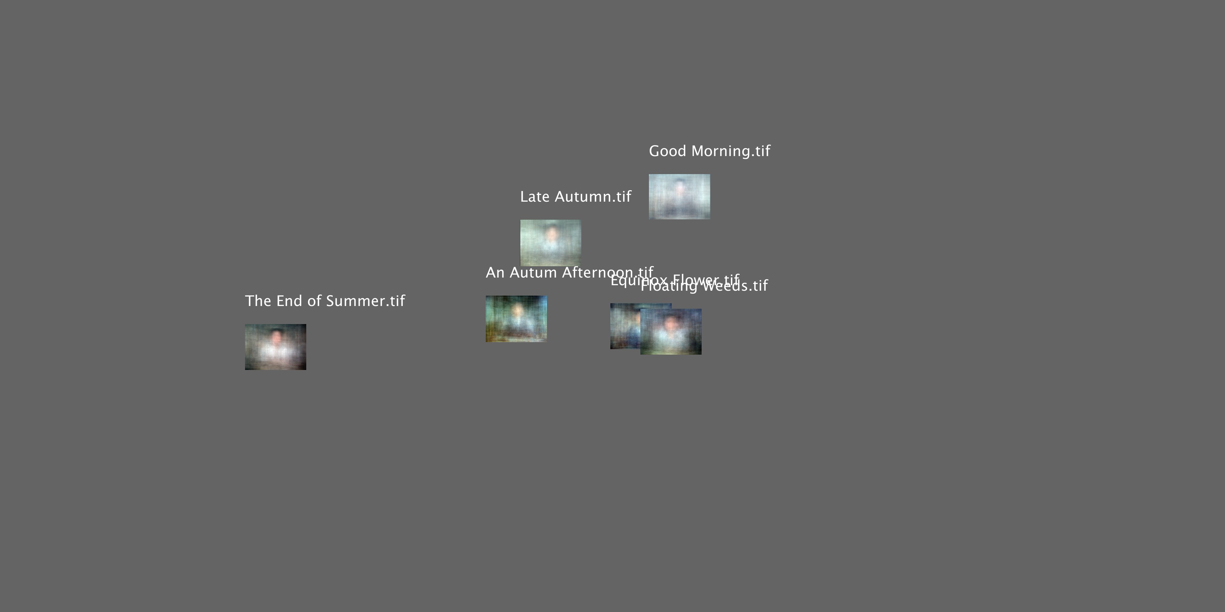
Below are the summed z-projections of Ozu’s six color films in chronological order:
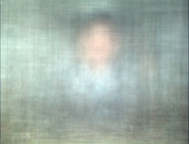
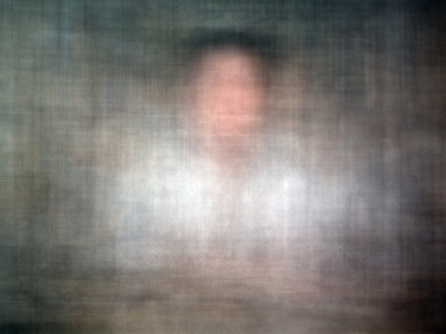
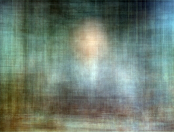
The first thing anyone is likely to notice between these images is their remarkable similarity of composition. All six z-projections have a ghostly human-esque shape at their center. Dark hair, the shape of a face, and something resembling shoulders and a torso are easily discernible, as is some semblance of clothing—a faint exposure of a tie and suit-jacket can even be seen in both Equinox Flower and An Autumn Afternoon, both films with middle-aged salarymen struggling with generational differences at their centers. One possible reading of the consistency across these images is that they illustrate the rigorous conventions of Ozu’s style as enumerated by Bingham and many others. This extends even to Ozu himself who self-characterized as “strictly a tofu dealer,” referring to the repeated uses of actors, plots, and cinematographic and editing techniques in their filmmaking (Richie, p. 10). But, tofu dealer or no, these images provide us with more insight than may initially meet the eye.
When we chart these summed images using ImagePlot, we can see some puzzling relationships emerge. The graph below plots the median hue value along its x-axis and median brightness along the y-axis:
Interestingly, the “brightest” film by this measure is Good Morning while the “darkest” is The End of Summer. Also, note how the the hue orientation of Good Morning has shifted radically from the red/brown region observed earlier to a considerably more centralized location on graph. This is peculiar, as one might expect the “summed” image of a film with a demonstratively red/brown palette to exhibit the same color qualities. If we take a look at the median brightness measurement of Good Morning, we can see how this might have produced such an image. The two charts below plot both Good Morning and The End of Summer chronologically along the x-axis. Each “slice” was taken at an interval of 1 frame every 2 seconds and, read left to right, encompasses the duration of film. The y-axis measures the median brightness value for each slice:
We can clearly see how The End of Summer is a “darker” film based on how low its baseline median brightness values sit in the graph. And while Good Morning is generally a brighter film by comparison, it’s still difficult to account for the lack of red or brown color in the summed image. If we plot this film by relating median hue and brightness values, we are able to more directly see the relationship between color and brightness:
We can see a similar clustering around the red/brown region of the graph, but also worth noting is the brighter images which appear far off into the blue bands. Perhaps the intensity of these images has “shifted” our chromatic impression of this film away from our expectations? Ferguson observes a similar phenomenon (2017, Figures 43 + 44) wherein certain bright, static images (or, in this case, qualities of images) bleed through the summed projection to become dominant parts of the image (we saw this earlier, too, with the semblance of a suit and tie in the projections for An Autumn Afternoon and Equinox Flower). I agree with Ferguson’s assessment that this requires some further investigation, but this curious artifact of the digital surrealist research method exposes some unexpected, fruitful products of “Dali’s paranoiac-critical method” as rendered through digital tools (2016, p. 274).
Conclusions
The findings and research presented here represent only an initial foray into how color operates in the work of Ozu. This investigation shows that while the infamously scrupulous and methodical auteur retained very strong formal consistency across their final six films (and that many of these qualities also align with other films from their “mature” period), the expanded expressive opportunities afforded by the use of color are realized in multiple capacities. Future investigations may want to focus on specific hues or tonalities, following up on Bordwell’s ascertain that “[Ozu] favored neutral or pastel shades for floors and walls and bright saturated colors for objects…He was especially fond of red (‘People who like red are either geniuses or madmen’) and…kept a special reserve of red matchboxes, cups, teakettles, and other props” (1988, p. 83). Perhaps, either through the more advanced features of ImageJ or by leveraging the work of other projects such as Distant Viewing TV, a kind of data-driven approach to mapping the presence of “reds,” “pastels,” or other chromatic features across Ozu’s color films could be developed.
Ultimately, it is my hope that this project continues to grow and evolve as my knowledge increases, new research and tools become available, and more scholars, artists, and filmmakers engage with these methods and ideas. I agree whole-heartedly with Mark Sample’s assertion that DH isn’t about building, it’s about sharing and I will definitely strive to share any new insights as I discover them and I will do best to respond to any inquiries related to helping/consulting/troubleshooting any of these tools as needed. To that end, please take advantage of the Resources and Learning Tools listed on this site and support the people and organizations that have made them available to us.
Next: Works Cited

This work is licensed under a Creative Commons Attribution-NonCommercial 4.0 International License.